Showing posts with label self-expression. Show all posts

Friday, September 5, 2014

More Art in 2014

http://teresayoung.artistwebsites.com/
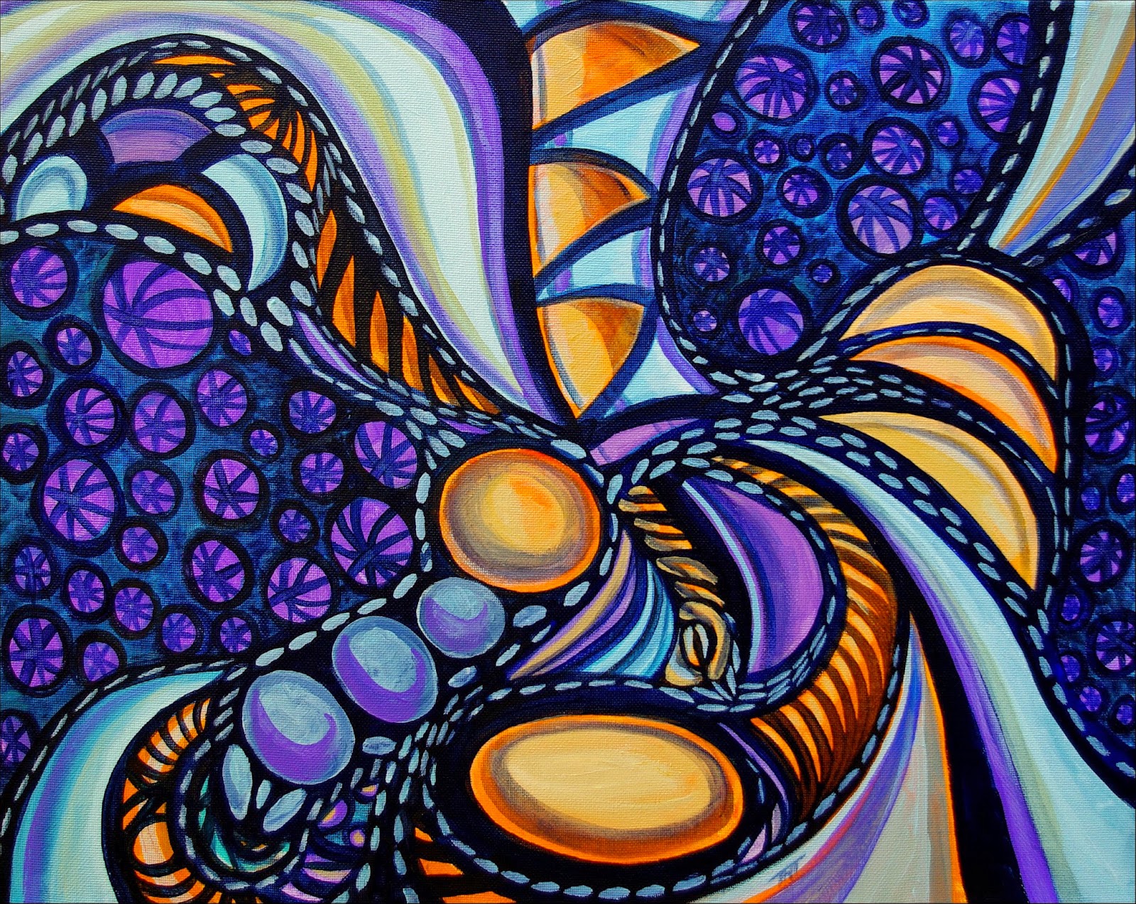
African Dreams by Teresa Young
11x14 in, acrylic on canvas.


http://teresayoung.artistwebsites.com/
Bubble Floats by Teresa Young11x14 in, acrylic on canvas.


http://teresayoung.artistwebsites.com/
Primary Calls by Teresa Young60 x 80 cm, acrylic on canvas.


http://teresayoung.artistwebsites.com/
Darkness Rolls by Teresa Young16x20in, acrylic on canvas.


http://teresayoung.artistwebsites.com/
Divine Dance by Teresa Young16x20in, acrylic on canvas.


http://teresayoung.artistwebsites.com/
Freedom of Imagination by Teresa Young16x20in, acrylic on canvas.


http://teresayoung.artistwebsites.com/
Lavender Skies by Teresa Young16x20in, acrylic on canvas.


http://teresayoung.artistwebsites.com/
Liberty in Shadows by Teresa Young16x20in, acrylic on canvas.


http://teresayoung.artistwebsites.com/
Retrieving My Roots by Teresa Young16x20in, acrylic on canvas.


Tuesday, October 22, 2013

How I Create A Glass Painting

First, I prepare the glass for the paint by using a prep fluid I buy at Michael's and let it dry overnight.
For the next step, I sometimes prepare a design in advance and draw it on a white piece of paper which I put behind the glass as a guide (only works with clear glass this way...). And you can also draw on the glass with permanent ink that is not too slippery. Just make sure that the liquid leading completely covers your guide lines... The other side effect of drawing directly on the glass is that you see the lines through the other side, which I don't like, so I don't do that myself.
-Usually though, I play it by ear and do the drawing using the liquid leading that I apply to the glass. The initial drawing is very, very simple, like the photo at left, because applying the coloured paint always goes over the initial lines, so I have to redo the lines again after the coloured glass panes are done. This also makes sure that the leading ends up being raised like real leading which increases its similarity to real stained glass visually.
I have pen tips that I screw onto the tops of the liquid leading bottles I buy at Michaels.  These allow me to create much finer lines than what the bottles of liquid leading create originally. I bought the pen tips at Michaels as well, but I have no idea what they are designed to be used for normally though.
I usually buy frames with glass on sale and use those myself. What I've done is remove all the backing from the glass in the frame, then put glazier's putty (available from some hardware stores, it's grey in colour and dries fairly stiff over time) over the edges of the glass and then put small pieces of wood over the putty and paint the wood black. Once the putty dries, the wood is securely held in place, just like a window frame...
Sometimes, (when I have the time and money), I put another layer of glass over the back of the glass again, with special glass that filters ultravoilet light out to preserve an especially good glass work that I want to hang in a west facing window that get a lot of light. Direct sunlight when the sun is especially bright can fade the colours over time, so this helps a lot. But it can get expensive.

Back to the process itself.
I have many bottles of glass paint that I use for the painting, you can use qtips and toothpicks to refine what you've put down on the glass for coloured areas, I used to use the toothpicks a lot to remove bubbles in the glass paint layer at the beginning, but now, I find the even side to side motion I use works just as well. But this stroke has to be very even in motion to avoid bubbles, and never, ever shake the bottles or it will take overnight for the bubbles to settle out of the paint. Otherwise, you end up with a paint that ensures bubbles over every square inch. Which, now that I think it over, could an interesting effect in itself!
I use many layers and overlapping colours to create shading and visual interest and also to avoid that plastic/fake look that I dislike so much!
Different paints give varying levels of opacity and translucency, so you've got a large range to play with. I use cameo ivory and white pearl for dotting a lot because they are fairly opaque and give nice effects.
Once the paint layers have dried, I use liquid leading over top to clean up the painting and smooth out the finished product. I use it to balance the composition if necessary, and correct any air bubbles I might have missed by putting in new divisions of paints to hide them. I add different colours to the new panes so that it looks like I planned the 'accidents' as part of the original composition.  I often end up with something new and totally different that I like much, much more.
Once I'm satisfied, I leave the painting dry for a week, and then varnish it with glass varnish (two coats), to protect it from the elements and allow it to be washed with gentle soap and water in the future.
Slate Blue is pretty transparent and it's great for shading
other colours because it gives a nice, attractive shadowy effect, as does charcoal black and champagne.
Amber is one of my favourite underpainting colours because it works with pretty well everything as well as by itself.
Rose is especially beautiful and mixes well as well...  High colour paints that work well are morning glory, aqua, fresh lime, sapphire, ruby red and so on. But I'm pretty careful with those, because the larger the area of high colour, and the smoother it is, the faker it looks.  I also use crackle a lot to create texture in larger areas, it work extremely well and gives a close match to a lot of stained glass textures.

http://teresayoung.artistwebsites.com/
As you can see by the glass painting at right, I used a lot of very bright red in large panes in the composition. To combat the fake plastic look that I initially ended up with, I used dotting of another paint colour to texture the panes and give visual interest. It also made it reminiscent of pointellism or ink drawing by using the dots, which made it attractive.
Putting crackle over a paint layer that is dry, cracks the paint evenly, giving one style of effect. Putting it on a wet layer, cracks it so that the edges get extra paint stuck in it, so it's almost like bolding the broken edges, putting wet paint over dry crackle areas give pools of darker paint in the cracks, and put wet paint over wet crackle layers gives the same effect as layering them in the opposite order. There are other types of glass paints like crackle that give textures available, but I haven't really experimented with them much as they don't appear to work as well as crackle does...
Once the paint layers have dried, I use liquid leading over top to clean up the painting and smooth out the finished product. I use it to balance the composition if necessary, and correct any air bubbles I might have missed by putting in new divisions of paints to hide them. I add different colours to the new panes so that it looks like I planned the 'accidents' as part of the original composition.  I often end up with something new and totally different that I like much, much more.
Then, I leave the painting dry for a week, and varnish it with glass varnish (two coats), to protect it from the elements and allow it to be washed with gentle soap and water in the future.

Saturday, January 19, 2013

First Post of 2013!

It's been quite a while since I've written a post here, what can I say, I thought I'd concentrate on painting for awhile, as I spent so much of 2012 sick, I didn't really paint as much as I normally do.

So, in mind of that, I'm going to put some of the artwork I've managed to create since beginning of November (my last post) here.


http://teresayoung.artistwebsites.com/
Abstract Entity by Teresa Young
http://teresayoung.artistwebsites.com/
Abstract Reality by Teresa Young
http://teresayoung.artistwebsites.com/
Coalescence by Teresa Young


http://teresayoung.artistwebsites.com/
Effervescent by Teresa Young


http://teresayoung.artistwebsites.com/
Elegant Oddity by Teresa Young


http://teresayoung.artistwebsites.com/
Dreams of Lothlorien by Teresa Young


http://teresayoung.artistwebsites.com/
Emotional Baggage by Teresa Young


http://teresayoung.artistwebsites.com/
Flowing Fractal by Teresa Young


http://teresayoung.artistwebsites.com/
It's All Connected by Teresa Young


http://teresayoung.artistwebsites.com/
Living In a Jumble by Teresa Young


http://teresayoung.artistwebsites.com/
Symbology Revisited by Teresa Young


http://teresayoung.artistwebsites.com/
Nostalgic Reverbations by Teresa Young


http://teresayoung.artistwebsites.com/
Molten Gold by Teresa Young


http://teresayoung.artistwebsites.com/
Shadowed Shauna by Teresa Young


http://teresayoung.artistwebsites.com/
The Weight of Tradition by Teresa Young


http://teresayoung.artistwebsites.com/
Translocation Through the Mind of a Dreamer by Teresa Young


http://teresayoung.artistwebsites.com/
Vertigo by Teresa Young


http://teresayoung.artistwebsites.com/
Weird and Wonderful by Teresa Young

Tuesday, August 7, 2012

My Journey Through Life, Evolution of an Artist's Style

My Journey Through Life, Evolution of an Artist's Style.

I've created a storyboard of stages in my life and the style of painting and drawing associated with that life phase.

Just a sort of interesting visual progression of how I, and my art style evolved over the years.

http://teresayoung.artistwebsites.com/

Thursday, March 22, 2012

New Art For 2012

Also published on www.teresa-young.net:

http://dalifan-teresa.deviantart.com/art/Confidence-In-Motion-283290016
Confidence In Motion-Feb.2012-
by Teresa Young
Clown College shown at
ARTOUR-O in Florence.
I've been doing a fair bit of drawing and painting this year, getting my feet wet with interacting with other artists online.

I've really found that it can inspire you to create more art to look at what other creative people are up to online!
http://www.teresa-young.net/art/something-to-do-with-creepy-staring-eyes/
Something To Do With Creepy Staring Eyes,
Feb.2012-by Teresa Young

Earlier this year, I created a lovely acrylic painting an art contest run by Subaru Canada that finished with an exhibition at the Toronto Auto Show. While I didn't win, it was fun to get my artwork out there and have people see it in a non-typical setting! Confidence In Motion was my entry into the contest;-) I finally finished my glass painting of an eye, had a bit of trouble finding a title for the work, and in fact, I became attached to the working title I had put on it, so I decided to keep it!
http://www.teresa-young.net/art/sunrise-of-symbology/
Sunrise of Symbology, Mar.2012
-by Teresa Young.

http://www.teresa-young.net/art/entubation/
Entubation, Mar.2012
-by Teresa Young.
I was also part of a group exhibit at Artists Haven Gallery in Fort I Lauderdale FL during the month of February.
I exhibited a couple of paintings in a group exhibition in Florence at the beginning of March, Vivid Arts: A Retrospective, as part of the ARTOUR-O Florence 2012 Temporary Museum of Contemporary Art Auditorium al Duomo Via de' Cerretani, Italy.
Lately though, I've been spending time on DeviantArt, getting to know other artists. My site there has grown, and does contain a fair amount of work I don't have on my regular site. As the loading times and storage there seems to be a bit better for usability.
http://www.teresa-young.net/art/exhale/
Exhale, March 2012
-by Teresa Young.
http://www.teresa-young.net/art/a-particular-venom/
A Particular Venom-March 2012,
 by Teresa Young
Well, I think I'm getting overlong here on this post, or I'm really out of practice, so I think I will just add in the rest of my current 2012 art pieces for people to take a look at;-)


http://www.teresa-young.net/art/cut-to-the-quick/
Cut To The Quick, March 2012-by Teresa Young.

http://www.teresa-young.net/art/dreams-of-lothlorien/
Dreams of Lothlorien, March 2012-by Teresa Young.

Thursday, November 17, 2011

Canadian Artist Teresa Young and British Artist Penelope Oakley’s Collaboration 2011


Teresa Young and Penelope Oakley are embarking on their first collaborative artwork together, after they initially connected through the Celeste Prize network, an international artist’s network at the beginning of 2011. 
Their artworks first appeared together side by side at the Camden Art Gallery, London in a Collective Exhibition in January.  From there they both exhibited at the Scoletta di San Giovanni Battista, Venice in concurrent exhibitions in May and June.
Their current involvement together in another exhibition in Mississippi, USA with The Energy Art Movement sees some of their pieces coincidentally again next to each other on the same wall.  Both artists are involved with the UNICEF Arte Maggio 2012 Reconstructing Childhood project.
Strangely enough, both artists were both born in Surrey, Penelope in Surrey England and Teresa in Surrey Canada. Although separated by the Atlantic, they have a lot in common, age group, backgrounds, love of art and artistic approaches. A true product of our electronics age, they have become fast friends although they have yet to meet in person.
Their idea for a collaborative work was a natural instinct for both.  Since Penelope’s flowing style was surrealistic, energetic and dominated by patterns of light, and Teresa’s work was flowing, patternistic and organic, their styles were a natural fit to harmonize together in one piece. With that in mind, Teresa has painted an intricate background in her own distinctive abstract style with Penelope’s artistic style in mind. The acrylic painting is two feet wide by three feet high and the original has now safely arrived with Penelope for her to commence her contribution to the piece.  This as yet untitled work will be exhibited when complete.  Keep an eye out here for further updates.
Two earlier works by Teresa Young can be seen at the JAG Gallery with Penelope’s work at Madeira Drive, Brighton and will be a part of the Christmas AOH 2011 Exhibition……

Websites:  http://teresayoung.artistwebsites.com/ and www.penelopeoakley.com

Saturday, August 6, 2011

But What Does It Mean?

http://teresayoung.artistwebsites.com/
Untitled Glass Art by Teresa Young
I've often been asked that question by people viewing my artwork, and it's a reasonable question which doesn't really have a reasonable answer...  Art is such a subjective thing, it really depends on the point of view of the person looking at the artwork, and it's even more subjective when you are dealing with abstracted or surrealistic images!
This conundrum is probably responsible for the unsatisfying answers people get from artists, and me in particular when they ask that question.  I can tell you what it means to me at that moment in time, but I can't tell you what it means to you.  The artwork could be hitting you on an emotional, visceral level, which could mean you either hate it, or really like it, and I wouldn't necessarily be able to figure out why it appeals to you. (Or doesn't for that matter!)

http://teresayoung.artistwebsites.com/
Fauvist Fantasy by Teresa Young.
I've had eighty year old grandmother's love my artwork, so much for traditional likes and dislikes. And I can never predict who will. It seems to have a pretty broad appeal though, so I take that as a good sign.
Now that I've expressed my opinion on art and how subjective it is, and how anything I say probably doesn't apply to you, the viewer anyway, I'm going to go ahead and tell you with some of my pieces what they mean to me...  Which is really just a snapshot in time anyway, depending on my mood, the meaning could change for me as I see something different in an existing painting.  Art is just like that, it's somewhat dynamic, which I think is part of it's appeal!

http://teresayoung.artistwebsites.com/
Sunken Treasure by Teresa Young
Take Fauvist Fantasy above, I was experimenting with glass paints and the creative urge took me in a very red, red, and blue direction. I was feeling very happy and enjoyed the beauty of the world around me that day, and I think that carnival feeling came out in the artwork. It's merely an emotional celebration of painting in itself, and how it makes me happy to do it.
Sunken Treasure on the other hand, goes back to when I used to scuba dive in my late teens and how I really loved the feeling when I was under the water below thirty or forty feet. When I took my scuba ticket there was this little octopus less than a foot across that swam near me, I played with it under that water until is squirt ink and swam away! 
The ocean has always seemed magical and like another world, sort of a treasure trove of beauty that most of us never get to see. I felt honoured to have been able to experience that beauty, and it really came out in this painting!

http://teresayoung.artistwebsites.com/
Emergence by Teresa Young
This is sort of fun, I'm going to do another!
Emergence is pretty obvious, if you had happened to know where my life was in 1998 when I painted it. 

I was in the process of divorcing and the feelings of learning to be independent and forging my own identity again were really at the forefront of my psyche. I like the way the woman is pushing up through a semi-formless muck to emerge into the light!

I was living on the west coast of Canada at the time, and that's why you can see a mountain range in the background. The really interesting thing about paintings is that they are often like the written word. They can have layers of meaning, like metaphor in stories, that I am often not aware of.

http://teresayoung.artistwebsites.com/
Figure Frog by Teresa Young
What I mean by that is the parallel in Emergence about is that on the surface it has a clear meaning, 'divorcing woman finding her identity', but it has a second meaning for me as an artist as well. I was in the process of developing my style, moving away from realism and into abstraction, using surrealism as a sort of intermediate step.

Sunken Treasure was also a 'crossover' piece for me in that it started out as a realistic piece that flowed into abstraction over time.


http://teresayoung.artistwebsites.com/
Cat's Emotions by Teresa Young
Figure Frog came about in the same timeframe, I think I sort of felt like I was leap-frogging ahead into the future. It's pretty nice to realize how bright everything can look to you when you are starting on a new path!  I think that why some of my pieces from the late nineties make me nostalgic.
Later on, my art started to change, as everything alive does, it evolves over time, which is why I can say I never paint that same thing twice!  I used to be a realistic painter, and did portraits in my youth, but I don't think I could settle down to realism again. It's like being nailed into a rigid box for me, I couldn't do it!

http://teresayoung.artistwebsites.com/
Carnival by Teresa Young
Cat's Emotions, another crossover piece, is actually a surreal watercolour painting with ink drawn into it. You have to get close to realize it's not realistic. I was expressing how much I loved cats and identified with them as a source of love and connection. Cats are pretty independent as well, so I think I admire that in them as well.

http://teresayoung.artistwebsites.com/
Escape by Teresa Young
Carnival is one of my favourite acrylic paintings. It feels like a roller coast ride of greens and blues to me. I see waves of light and joyous feeling, which is probably why the title of the piece...

http://teresayoung.artistwebsites.com/
The Wheels Art Turning
Escape, on the other hand, even though it doesn't seem like it, is an expression of frustration in the life I was living in the mid 2000's. 2003 or 4?  I was stuck in a corporate job with lots of responsibility and no voice. I was pretty close to starting a downward trend that ended up with me leaving the job I held for over a decade to start over in a new location. Like a lot of people in the IT industry, I was dissatisfied with the pressure and anxiety I experience.

http://teresayoung.artistwebsites.com/
Queen of Thorns
I felt like I really, really wanted to escape. The painting expressed that desire for me. And probably, it also expressed hope for a more serene existence somewhere out 'there'! That meaning applies to a lot of the artwork I did between 2002 and 2009, actually.  The Wheels Art Turning was about the feeling of being trapped and powerless in my job. I actually felt like no one was listening to me, and it sure came out in that painting!

http://teresayoung.artistwebsites.com/
Undercurrents
 Queen of Thorns, I painted after I put in my resignation and just a few days before I left. I sort of felt like I was letting a few people down, leaving the job and it's responsibilities behind. But I also felt that it was something I needed to do for my personal growth and well being. So I was being a queen, and pretty prickly about the decision!

http://teresayoung.artistwebsites.com/
Pushing For The Sky
Undercurrents was about moving on and the undercurrents and emotional overtones that are never expressed out loud. We sort of swim through these currents and never truly acknowledge what is really going on out there in the 'real' world.  I was trying to show the undercurrents of our everyday world with this rather large painting.
Pushing For The Sky is from this year, very recent, and it's about growth, life and moving forward.  Reaching for the sky, not trying to be too trite here!
I think I'm back in a 'trying to find my footing' or identity cycle again. I'm not sure we ever really find out who we are, because like the artwork we produce, we are constantly changing. And sometimes, we go through similar cycles in our life as we learn out life's lessons...