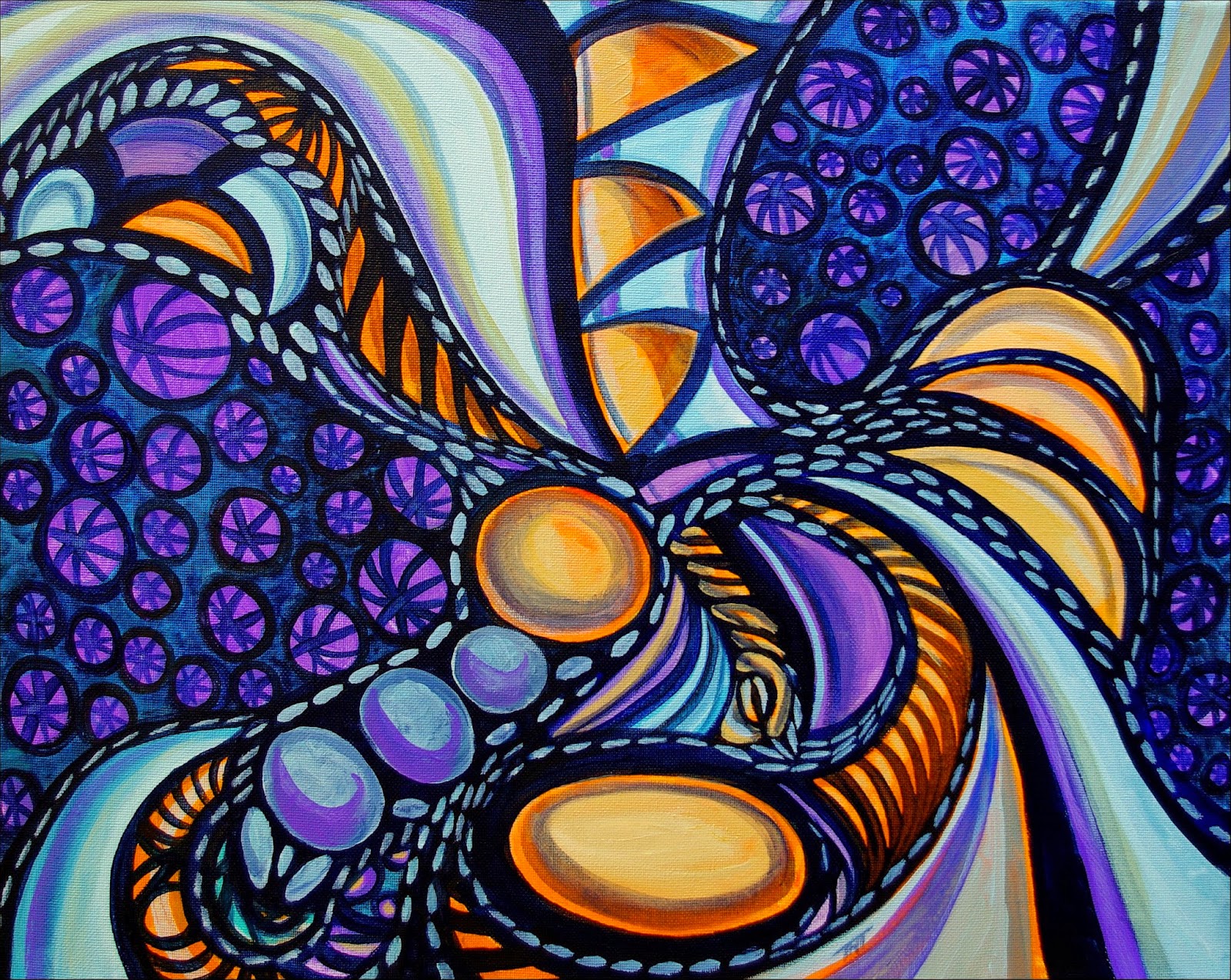
Showing posts with label Recent Art. Show all posts

Friday, September 5, 2014

More Art in 2014

http://teresayoung.artistwebsites.com/
African Dreams by Teresa Young
11x14 in, acrylic on canvas.


http://teresayoung.artistwebsites.com/
Bubble Floats by Teresa Young11x14 in, acrylic on canvas.


http://teresayoung.artistwebsites.com/
Primary Calls by Teresa Young60 x 80 cm, acrylic on canvas.


http://teresayoung.artistwebsites.com/
Darkness Rolls by Teresa Young16x20in, acrylic on canvas.


http://teresayoung.artistwebsites.com/
Divine Dance by Teresa Young16x20in, acrylic on canvas.


http://teresayoung.artistwebsites.com/
Freedom of Imagination by Teresa Young16x20in, acrylic on canvas.


http://teresayoung.artistwebsites.com/
Lavender Skies by Teresa Young16x20in, acrylic on canvas.


http://teresayoung.artistwebsites.com/
Liberty in Shadows by Teresa Young16x20in, acrylic on canvas.


http://teresayoung.artistwebsites.com/
Retrieving My Roots by Teresa Young16x20in, acrylic on canvas.


Tuesday, October 22, 2013

How I Create A Glass Painting

First, I prepare the glass for the paint by using a prep fluid I buy at Michael's and let it dry overnight.
For the next step, I sometimes prepare a design in advance and draw it on a white piece of paper which I put behind the glass as a guide (only works with clear glass this way...). And you can also draw on the glass with permanent ink that is not too slippery. Just make sure that the liquid leading completely covers your guide lines... The other side effect of drawing directly on the glass is that you see the lines through the other side, which I don't like, so I don't do that myself.
-Usually though, I play it by ear and do the drawing using the liquid leading that I apply to the glass. The initial drawing is very, very simple, like the photo at left, because applying the coloured paint always goes over the initial lines, so I have to redo the lines again after the coloured glass panes are done. This also makes sure that the leading ends up being raised like real leading which increases its similarity to real stained glass visually.
I have pen tips that I screw onto the tops of the liquid leading bottles I buy at Michaels.  These allow me to create much finer lines than what the bottles of liquid leading create originally. I bought the pen tips at Michaels as well, but I have no idea what they are designed to be used for normally though.
I usually buy frames with glass on sale and use those myself. What I've done is remove all the backing from the glass in the frame, then put glazier's putty (available from some hardware stores, it's grey in colour and dries fairly stiff over time) over the edges of the glass and then put small pieces of wood over the putty and paint the wood black. Once the putty dries, the wood is securely held in place, just like a window frame...
Sometimes, (when I have the time and money), I put another layer of glass over the back of the glass again, with special glass that filters ultravoilet light out to preserve an especially good glass work that I want to hang in a west facing window that get a lot of light. Direct sunlight when the sun is especially bright can fade the colours over time, so this helps a lot. But it can get expensive.

Back to the process itself.
I have many bottles of glass paint that I use for the painting, you can use qtips and toothpicks to refine what you've put down on the glass for coloured areas, I used to use the toothpicks a lot to remove bubbles in the glass paint layer at the beginning, but now, I find the even side to side motion I use works just as well. But this stroke has to be very even in motion to avoid bubbles, and never, ever shake the bottles or it will take overnight for the bubbles to settle out of the paint. Otherwise, you end up with a paint that ensures bubbles over every square inch. Which, now that I think it over, could an interesting effect in itself!
I use many layers and overlapping colours to create shading and visual interest and also to avoid that plastic/fake look that I dislike so much!
Different paints give varying levels of opacity and translucency, so you've got a large range to play with. I use cameo ivory and white pearl for dotting a lot because they are fairly opaque and give nice effects.
Once the paint layers have dried, I use liquid leading over top to clean up the painting and smooth out the finished product. I use it to balance the composition if necessary, and correct any air bubbles I might have missed by putting in new divisions of paints to hide them. I add different colours to the new panes so that it looks like I planned the 'accidents' as part of the original composition.  I often end up with something new and totally different that I like much, much more.
Once I'm satisfied, I leave the painting dry for a week, and then varnish it with glass varnish (two coats), to protect it from the elements and allow it to be washed with gentle soap and water in the future.
Slate Blue is pretty transparent and it's great for shading
other colours because it gives a nice, attractive shadowy effect, as does charcoal black and champagne.
Amber is one of my favourite underpainting colours because it works with pretty well everything as well as by itself.
Rose is especially beautiful and mixes well as well...  High colour paints that work well are morning glory, aqua, fresh lime, sapphire, ruby red and so on. But I'm pretty careful with those, because the larger the area of high colour, and the smoother it is, the faker it looks.  I also use crackle a lot to create texture in larger areas, it work extremely well and gives a close match to a lot of stained glass textures.

http://teresayoung.artistwebsites.com/
As you can see by the glass painting at right, I used a lot of very bright red in large panes in the composition. To combat the fake plastic look that I initially ended up with, I used dotting of another paint colour to texture the panes and give visual interest. It also made it reminiscent of pointellism or ink drawing by using the dots, which made it attractive.
Putting crackle over a paint layer that is dry, cracks the paint evenly, giving one style of effect. Putting it on a wet layer, cracks it so that the edges get extra paint stuck in it, so it's almost like bolding the broken edges, putting wet paint over dry crackle areas give pools of darker paint in the cracks, and put wet paint over wet crackle layers gives the same effect as layering them in the opposite order. There are other types of glass paints like crackle that give textures available, but I haven't really experimented with them much as they don't appear to work as well as crackle does...
Once the paint layers have dried, I use liquid leading over top to clean up the painting and smooth out the finished product. I use it to balance the composition if necessary, and correct any air bubbles I might have missed by putting in new divisions of paints to hide them. I add different colours to the new panes so that it looks like I planned the 'accidents' as part of the original composition.  I often end up with something new and totally different that I like much, much more.
Then, I leave the painting dry for a week, and varnish it with glass varnish (two coats), to protect it from the elements and allow it to be washed with gentle soap and water in the future.

Saturday, January 19, 2013

First Post of 2013!

It's been quite a while since I've written a post here, what can I say, I thought I'd concentrate on painting for awhile, as I spent so much of 2012 sick, I didn't really paint as much as I normally do.

So, in mind of that, I'm going to put some of the artwork I've managed to create since beginning of November (my last post) here.


http://teresayoung.artistwebsites.com/
Abstract Entity by Teresa Young
http://teresayoung.artistwebsites.com/
Abstract Reality by Teresa Young
http://teresayoung.artistwebsites.com/
Coalescence by Teresa Young


http://teresayoung.artistwebsites.com/
Effervescent by Teresa Young


http://teresayoung.artistwebsites.com/
Elegant Oddity by Teresa Young


http://teresayoung.artistwebsites.com/
Dreams of Lothlorien by Teresa Young


http://teresayoung.artistwebsites.com/
Emotional Baggage by Teresa Young


http://teresayoung.artistwebsites.com/
Flowing Fractal by Teresa Young


http://teresayoung.artistwebsites.com/
It's All Connected by Teresa Young


http://teresayoung.artistwebsites.com/
Living In a Jumble by Teresa Young


http://teresayoung.artistwebsites.com/
Symbology Revisited by Teresa Young


http://teresayoung.artistwebsites.com/
Nostalgic Reverbations by Teresa Young


http://teresayoung.artistwebsites.com/
Molten Gold by Teresa Young


http://teresayoung.artistwebsites.com/
Shadowed Shauna by Teresa Young


http://teresayoung.artistwebsites.com/
The Weight of Tradition by Teresa Young


http://teresayoung.artistwebsites.com/
Translocation Through the Mind of a Dreamer by Teresa Young


http://teresayoung.artistwebsites.com/
Vertigo by Teresa Young


http://teresayoung.artistwebsites.com/
Weird and Wonderful by Teresa Young

Friday, October 12, 2012

Recent Art Awards and Exhibitions Last Quarter 2012

About Recent Artwork:
http://teresayoung.artistwebsites.com/
A Dream of Sentient Paisley
A work in progress by
Teresa Young.
http://teresayoung.artistwebsites.com/Well it's been an interesting year, but I certainly didn't get as much painting done as I would have liked! 
I've been experimenting with new techniques lately just to keep the creativity going, so I just finished a couple of paintings in the last week that were acrylic, but used acrylic gold paint for highlighting. It's very glittery and shiny! I like it! Unfortunately, the paintings are so new, I haven't managed to get good photos of them yet. I'll have to include them in a future post.

The Omnia Scroll Worldwide Tour:
Coming up on November 14th to December 12th, 2012, I am one of thirteen artists exhibiting at the Brighton Jubilee Library, a gorgeous venue as the ceiling goes up and up, and there is a wall of windows extending two stories that borders on the street.
My good friend Penelope Oakley, a wonderful artist in the UK and I collaborated on a painting this year that will be a part of this exhibition. As well as the painting image I've embedded above, 'A Dream of Sentient Paisley'. The artworks in this exhibition will be the initial images added in high resolution printing onto a banner that will expand over time called the 'Omnia Scroll'. This is pretty exciting as this is going to be an ongoing projec that expands over time. Penny is in talks to curate further exhibitions in this project path in Italy and Mexico. I'm hoping she manages to get something going for Canada at some point because I'd love to see this come to my home country!
For more details, please go to www.PenelopeOakley.org.

Physical Exhibitions of my paintings:
As I post this, I have artwork in two physical exhibitions, one in Berlin, Germany and the other in a very nice local restaurant in Hubbards, Nova Scotia Canada.
The Berlin exhibition starts on October 18th and runs until the end of the month. The restaurant exhibition, which is at a local establishment called 'The Trellis', is a group exhibition which the local art association I belong to puts on annually in October. It's called 'Home Grown 2012 - A Visual Feast' and started on October 6th and will run until November 3rd. There are some beautiful paintings in there, over twenty artists submitted this year, and as the owner remarked during the hangings, the artwork just gets better every year! Trellis Show 2012


http://teresayoung.artistwebsites.com/
Something To Do With Creepy
Starying Eyes, Glass art by
Teresa Young.
Another local exhibition I have the honour of being included in is occurring starting October 20th and ending on November 3rd, 2012. The exhibition is the result of a local competition called 'Creature Feature', a Halloween show!

Online Exhibitions and Competitions:
 Other exhibitions include the '14th Annual Abstraction Juried Online International Art Exhibition' a group show that results from the Upstream People Gallery's competition that ran last month. I managed to place as one of the finalists in this competition (yay!), gaining special recognition for two of my pieces: 'Chaos Out of Confusion' and 'The Ripple Effect'.


http://teresayoung.artistwebsites.com/
Exhale by Teresa Young
Another competition I entered online and managed to win in a month or more ago was on a gallery site called the 'The Abstract Artist Gallery'. Pretty close to my heart, considering my art style!The competition was titled 'The 2012 International Abstract Art Contest' and contained three separate categories where you could win, as well as an overall winner designation. I was lucky enough to win the best in category award for 'Whispers and Other Worlds' with my fantasy abstract piece 'Exhale'.


http://teresayoung.artistwebsites.com/
Mother Earth is Hiding by Teresa Young
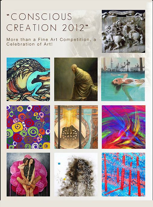
The arts network in Ferarra Italy that I'm a member of had a competition over the summer, and I was a finalist in it! The Vivid Arts Network Conscious Creation 2012 Fine Art Competition had a good response for entries, so I was quite honoured to win special recognition for my painting 'Mother Earth is Hiding'. The really nice thing about this award is that the artwork was included in an article in the Art Tour Magazine October 2012 issue, check out pages 24 and  31 on the preview link here.

Two other competitions that I was recently notified about:


http://teresayoung.artistwebsites.com/
Undersea Fantasy by Teresa Young
Shadows an online exhibition with the Linus Galleries website, based in southern California, US. The online link is in the process of being created, so I have no link to attach to this one. The painting that placed in that competition is Undersea Fantasy, which I created a nice statement for. It's pretty special to me as it was a product of my nostalgia for scuba diving in my youth!
Years ago, I was quite fond of scuba diving in the northern Pacific Ocean, exploring near the smaller islands around the Strait of Juan de Fuca. The undersea plant life in that cool water is quite different from the bright and colourful areas found in the far southern seas.
Since the ocean is so much colder, the colours are muted, and shadows predominate. The diver experiences a subtle, yet dangerous atmosphere, which makes for an enticing and mysterious experience. In this abstract acrylic artwork, a mass of dark patterns and colours dominate to capture that almost forgotten allure from my past aquatic adventures...


http://teresayoung.artistwebsites.com/
Synthetic Sunrise
by Teresa Young

 Open Art Exhibition – October 2012  Online Gallery Light Space & Time. I was lucky enough to receive a special recognition award for my acrylic painting, 'Synthetic Sunrise'.
I really liked doing this painting due to the sunset palette of colours I ended up creating there. It's quite powerful to work with the dark and moody colours to envision a future where our sunrises are something out of a dark fantasy.